Written on
Globalizing Software II
TL;DR You want to customize your UI to fit your target country’s cultural preferences. To find out what how to do so, start by looking at the most famous websites in that country.
Recap
In the last post, I talked about two main methods an application can apply in order to become a global application. The first method was to simply localized the app. The second method was to provide basic cultural support within the app for things such as string formatting and language specific input method.
UI Globalization
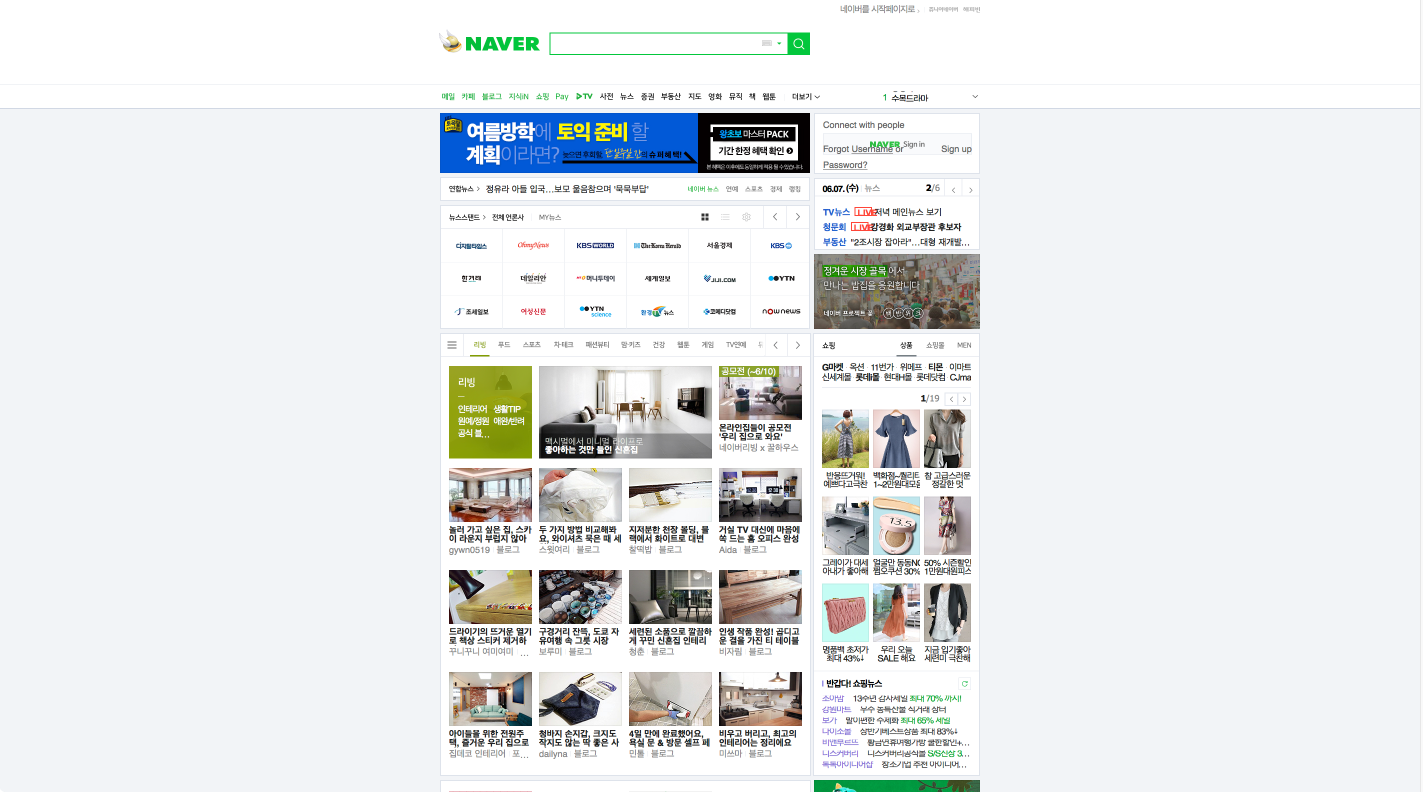
Despite the two methods listed above, the most important step towards globalizing an application is the globalization of the UI to fit the target country’s culture. In order to explain what I mean by this, I will take Naver as the example throughout this post. Naver is the larget search engine / media content provider company in Korea. Here’s a picture of its website compared to Google’s.
| Naver (Korea) | Google (US) |
|---|---|
 |
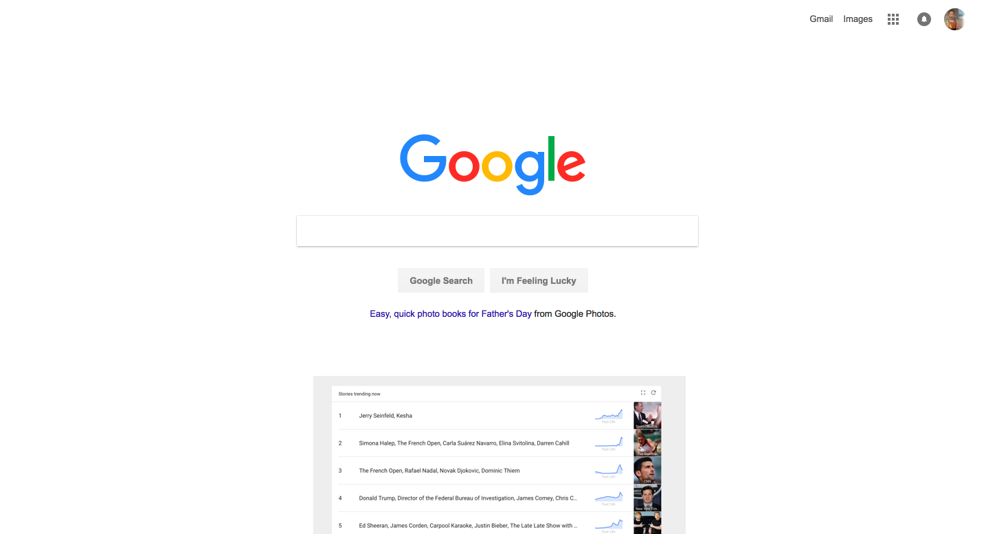 |
You can clearly see that while Naver’s web-page is littered with content, Google’s only has two buttons for searching and couple of buttons for various apps on the top.
Here’s another example,
| 11st Street (Korea) | Amazon (US) |
|---|---|
 |
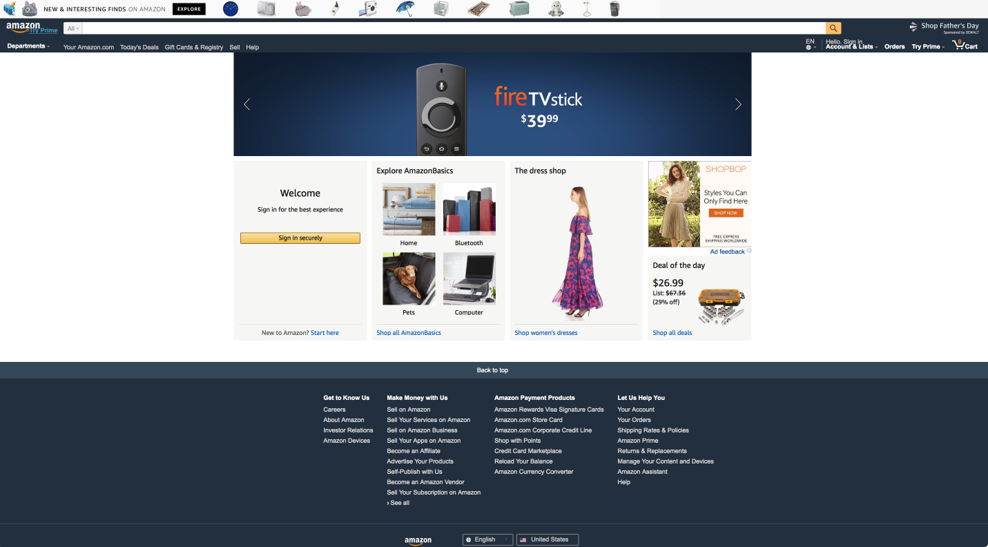 |
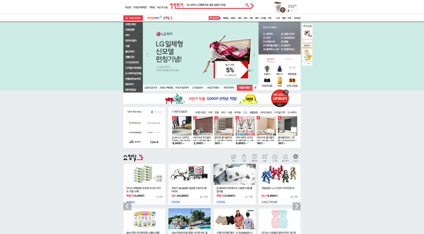
11st Street is one of the most popular shopping websites in Korea. You can see here again that the amount of information being shown on a website varies significantly between different cultures.
I could go on for days with these examples but I think you are starting to get the point.
Different cultures have different UI preferences.
Out of the thousands of reasons I am not smart enough to know, here are the two that I could think of.
Reason #1
In Korea, wealth of information is something people favor over the popular minimalism ideals supported by most American software companies. The reasoning behind this is that by being able to see more contents on a website, Koreans are able to catch up to the lastest news, fashion trends, and more. In a fast paced, image conscious culture such as Korea, being up to date on things matter on a personal and a social level.
Reasion #2
Here’s another way of thinking about it if you are still not convinced.
Everyday, countless people go to work using the extensive subway system in Korea. If you get on one, you will see that 90% of people are staring into their phone, 8% are sleeping, 0.5% are reading a book/newspaper and the rest are just staring into nothing; that would be me.  The 90% need something to do and as time went on, Naver became the goto website for people, henceforth making Naver an essential part of the culture. If you don’t know what Naver is, you probably are a Norht Korean spy. Heck, I bet they even know what it is! As people used Naver more and more, users became more comfortable with the website’s UI. In order to stay competitive, other websites began to take hints from Naver. And there you go… a specific UI preference just became part of the country’s culture. And at this point, that particular UI is hard set in the culture because
Culture tops personal preference most of the time.
Now, this is quite a statement to make and is almost the same as saying “Hipsters don’t exist”. But still, hipsters need good search engines too, right?
So, I’m not a culture expert on all 195 different countries in the world
Well, I understand that. If you were a big corporation like Google, you could just set up a local company in all 195 countries and solve the problem that way. But… you aren’t. So, here’s my suggestion.
Refer to the most famous websites in that country for design queues.
But it’s weird to think about Google abandoning material design to become like Naver after a single update, right? So, as the Lawrence of Arabia would say,
The trick is to incrementally adapt cultural UI queues.
Instead of going from 0 to 100 real quick, one should increment by 10 each quarter while observing users’ reaction to the change and making adjustments as needed.
0 to 10, not 100
One of the most used features in Naver is the Top 10 real-time searched keyword list. So, allow me to propose the first incremental change Google could make to adopt to Korean culture.
The continents would be the Korean peninsula but I’m working with limited graphic resources here!
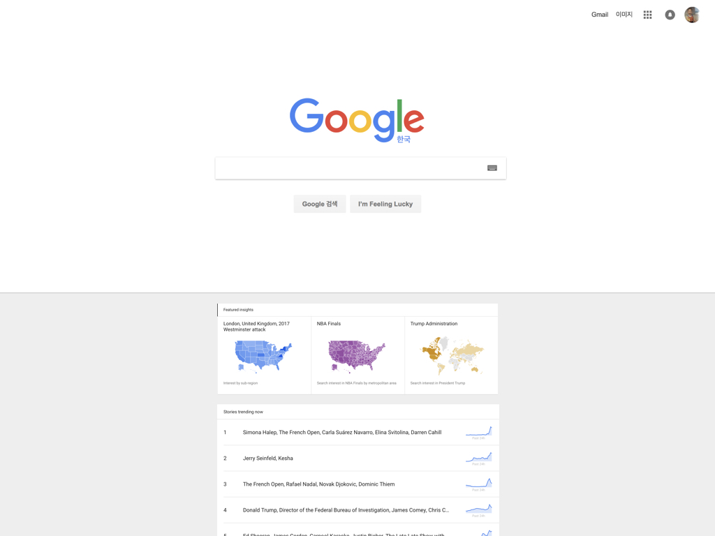
The above approach would be a good initial step towards UI globalization. And all I did was grab a UI from Google Trends and paste it on Google’s home page.
Wrap up
So… instead of just localizing couple of languages and saying “Ok, we just went global”, give some consideration about the UI and the culture of people who are going to be interacting with it by
- Look at the most visited website in the country
- Take notes on its UI
- Divide UI features into 10 (x) unique characteristics/elements
- Make necessary changes over 10 (x) quarters