Google Summer of Code Final Report Part 2
To be honest, things get kind of boring when you just write tests. To fix this, I wanted to do something more…. visually pleasing. Here are some of the work I did with VLC for iOS, which uses VLCKit as its backend :D
Design
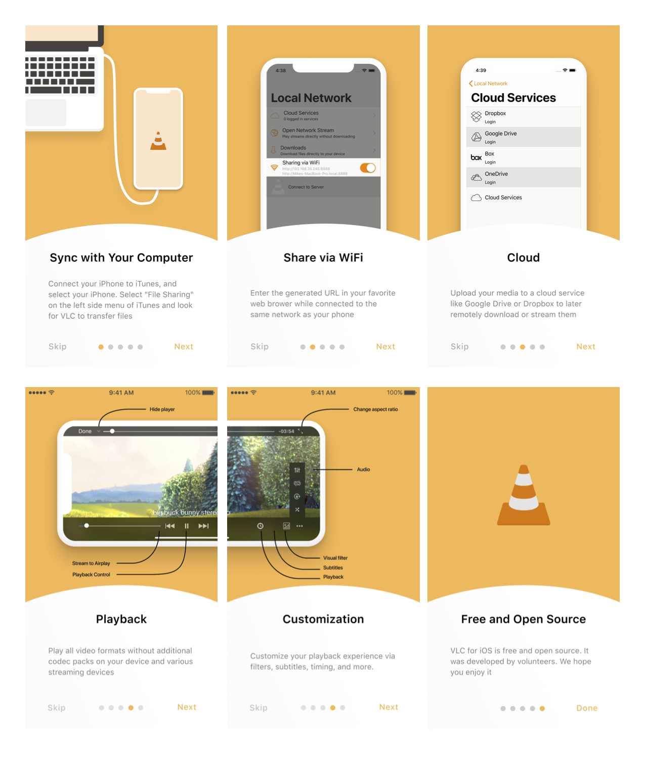
1. Tutorial screens
This required a lot of bouncing off ideas from lead designer, Louis. After about 3~4 feedback rounds from Louis, the designs started to take shape.
The purpose of the screens below are to teach the user the main features of VLC for iOS.

2. Application launch screens
With the new UI in the progress, the launchscreen was desperately in need of an upgrade. The design itself is simple but the number of different screens Apple requires is ridiculous!

And 11 more that look exactly the same!
Pull Requests
Previous Aug 4, 2018
« Google Summer of Code Final Report Part 1
« Google Summer of Code Final Report Part 1
Jan 25, 2024 Next
Man in the Arena »
Man in the Arena »